Now that I have finished my project I feel it would be helpful to have a conclusion and review decisions, analysing parts of the project that went well or anything that went wrong so I can improve next time.
Starting Point
I really struggled at the start of this project. I always find idea generation and the creative process very difficult, as I tend to panic about whether it's good enough or whether it fits the brief. My tutors helped me with this by suggesting research points and direction that proved useful and while ultimately I didn't completely use these it did help me get started, which always feels like the hardest part. I did write a schedule at the start of the project which helped me chart my progress and set myself small deadlines.
My Idea
Looking at it now I don't really know what my idea is about, but it seemed like a good idea at the time. I used slightly abstract ideas of text from my old idea but not on the same level, as there were clearly some tangible and recognisable elements. Stylised might be a more apt word for what I have produced. The visuals and music are very vibrant and more modern than what Magners is associated with, which is why I thought it would be a nice challenge to try and take it in a different direction with fast paced music. I still wanted a representation of heritage and age in there, so I came up with the idea old old wooden barrels and old ships taking the barrels from Ireland to England and this became what you see in my sequence. I'm not really sure if this works in the final result, but it seemed moderately popular among my peers at least.
Mistakes
I didn't make any 'mistakes', but there are things I should have done that I didn't and small things that might have helped me. One of the biggest things was that I had a hard time with the pacing and timing of my sequence. When I storyboarded the sequence I couldn't think of how it would work with the music until I started actually doing it, but as one of my tutor Giles pointed out making an Animatic would have really helped with this. It would have allowed me to get a feel for the pacing in time with the music without actually making it, just doing a rough using illustrations and elements adapted from my storyboards.
Best Parts of the Project
My favourite part in the project, and the part I enjoyed the most was preparing my files in Photoshop and getting to grips with After Effects. Animating a camera in 3D space really opened my eyes to the possibilities and my piece only used a fraction of the potential.
Changes I Made
After the class crit I had a lot of feedback to work with so I could improve my sequence. I already commented on this in my original blog post but now at the end I should talk about what I did change.
I fixed the glitch with my sea not appearing, I improved the movement and look of the waves and I made the sea to drink transition faster. I changed the boat sequence by making many boats at different depths so there is more of a sense of 3D (one close to the camera, one far away), I added motion blur to make it look better and I made some of the animation more wild so they rock back and forward as they move. I changed the barrel scene so it falls differently, never leaves the screen, I made it fall sideways so when the camera turns the barrel corrects its orientation. I improved the timing and positioning of the typography throughout as well as matching it to the beat more. I changed the way my sequence worked so I could have the background move with the camera to give more of a sense of movement, so it is no longer static. I also improved some of the camera movement. I didn't add a splash when the barrel falls in the sea.
There are several other minor improvements made all over that will likely go unnoticed and I can't remember them.
Conclusion
Even though I had a very slow start with this project, and completely changed my mind half way through I believe I have created a satisfactory piece. As always there are many things that I would change if I could do it again but I have to present a finished piece even if I don't feel as though it's finished.

Showing posts with label Handmade. Show all posts
Showing posts with label Handmade. Show all posts


Visualisations
Here are my visualisations, putting my adverts in to the real world.


I have done 2 billboards and 1 magazine page.


I have done 2 billboards and 1 magazine page.
Is it Handmade?
In this post I will attempt to evaluate my work compared to the demands of the brief, and justifications for design decisions I have made. The project is called handmade, and starts off with:
First Idea
The first part of the project had us develop abstract pieces of art using traditional media. From this I began developing my first idea, focusing the work of abstract film makers from the 1940s. It was easy to see how these abstract pieces would fit in to my sequence as it worked well with the theme. After developing this idea with thumbnails I had doubts about whether or not I liked this idea, or thought it could work.
I had decided to drop this idea. Although the first step of the project focuses on an abstract ideal, I couldn't envision my work being an entertaining abstract piece. I then developed my current idea, which still uses abstract elements but much more tame and thematically linked with real world objects. I decided that the handmade aspect was the most important, as the abstract style seemed more like a suggestion and not a requirement on the brief. My piece still doesn't read in a completely tangible way, as there are words on a textured background and 2D sea forming a drink, so there are some slightly abstract elements left.
Second Idea
Starting out with this new idea I had to make sure I emphasised this handmade element using objects designed to look like handmade stage props, or styled in that way. As you will see in my sketchbook I have stuck in some of the props I made myself. Going along with the theme, I thought what better way to show handmade then for it to be handmade. These elements are comprised of materials and paints forming shapes that resemble objects (such as my pirate/cargo ship).
There was one major problem with my hand created pieces. They were bland. The waves I had painted were flat and boring. I had cut my ship out of cardboard, but the cardboard was very plain and uninteresting. I had experimented with making the cardboard rougher, making marks but this just made it look rough in a bad way. My pieces just weren't what I wanted. I could have brought these on to the computer and used digital manipulation to make them look better but I felt as though I couldn't achieve something satisfactory or organic.
Instead I had remembered and researched some textures from stock photograph websites and deviant art that were royalty free, and were far more interesting than what I had created. Although it would have been nice to use my own creations I felt that visually it was better to use these textures as the basis for my manipulations instead of trying to turn my hand made elements in to something more workable. My experiments with these textures turned out to be very rewarding as I got much more visually pleasing results and I could use my physical experiments as a basis so I did not waste any time or effort.
The decision to use sourced textures instead of my own crafted elements begs the question: is it handmade? Based on the requirements of the brief and the results I would say, yes. The brief seems to place an importance on the result, the aesthetics having the appearance of being handmade (even specifically mentioning rough looking elements) and I believe I have achieved that through manipulating these textures. They give the appearance of hand crafted, hand painted, or just looking rough (my background).
The main criticism I can see me receiving for this decision is that I have taken the easy way out. I am too lazy or untalented to produce my own work. It is hard for me to defend this as it has a point, but I just want to make it clear that my use of these textures is for the benefit of the finished product and not to hide any deficiencies in my own abilities or effort put in to this project. I explain these issues with faith that my decisions might be understood by someone other than myself.
If you look at my sketch book and at the PSD files it becomes clear that my digital creations are far superior. Even though I tried with my physical creations they just weren't good enough or what I wanted.
In recent years there has been a growing trend towards introducing and incorporating hand drawn and handmade, rough elements to design and advertising.This intention has been clear to all of us from the beginning, as it is the title of the project. Nearing the deadline I think it is important to look at whether or not my piece fits this description. The focus here seems to be creating a piece that has the appearance of being handmade. This might often entail actually being made by hand and photographed, scanned or recorded as video. There are many examples of this on TV and online as mentioned in the brief.
First Idea
The first part of the project had us develop abstract pieces of art using traditional media. From this I began developing my first idea, focusing the work of abstract film makers from the 1940s. It was easy to see how these abstract pieces would fit in to my sequence as it worked well with the theme. After developing this idea with thumbnails I had doubts about whether or not I liked this idea, or thought it could work.
I had decided to drop this idea. Although the first step of the project focuses on an abstract ideal, I couldn't envision my work being an entertaining abstract piece. I then developed my current idea, which still uses abstract elements but much more tame and thematically linked with real world objects. I decided that the handmade aspect was the most important, as the abstract style seemed more like a suggestion and not a requirement on the brief. My piece still doesn't read in a completely tangible way, as there are words on a textured background and 2D sea forming a drink, so there are some slightly abstract elements left.
Second Idea
Starting out with this new idea I had to make sure I emphasised this handmade element using objects designed to look like handmade stage props, or styled in that way. As you will see in my sketchbook I have stuck in some of the props I made myself. Going along with the theme, I thought what better way to show handmade then for it to be handmade. These elements are comprised of materials and paints forming shapes that resemble objects (such as my pirate/cargo ship).
There was one major problem with my hand created pieces. They were bland. The waves I had painted were flat and boring. I had cut my ship out of cardboard, but the cardboard was very plain and uninteresting. I had experimented with making the cardboard rougher, making marks but this just made it look rough in a bad way. My pieces just weren't what I wanted. I could have brought these on to the computer and used digital manipulation to make them look better but I felt as though I couldn't achieve something satisfactory or organic.
Instead I had remembered and researched some textures from stock photograph websites and deviant art that were royalty free, and were far more interesting than what I had created. Although it would have been nice to use my own creations I felt that visually it was better to use these textures as the basis for my manipulations instead of trying to turn my hand made elements in to something more workable. My experiments with these textures turned out to be very rewarding as I got much more visually pleasing results and I could use my physical experiments as a basis so I did not waste any time or effort.
The decision to use sourced textures instead of my own crafted elements begs the question: is it handmade? Based on the requirements of the brief and the results I would say, yes. The brief seems to place an importance on the result, the aesthetics having the appearance of being handmade (even specifically mentioning rough looking elements) and I believe I have achieved that through manipulating these textures. They give the appearance of hand crafted, hand painted, or just looking rough (my background).
The main criticism I can see me receiving for this decision is that I have taken the easy way out. I am too lazy or untalented to produce my own work. It is hard for me to defend this as it has a point, but I just want to make it clear that my use of these textures is for the benefit of the finished product and not to hide any deficiencies in my own abilities or effort put in to this project. I explain these issues with faith that my decisions might be understood by someone other than myself.
If you look at my sketch book and at the PSD files it becomes clear that my digital creations are far superior. Even though I tried with my physical creations they just weren't good enough or what I wanted.
Class Criticism
On Thursday we held a class criticism session, in the middle of this project to gain feedback on our work so we can make modifications. I rushed to make sure I had a complete 30 seconds, even thought it was not perfect so that I could get sufficient feedback on the overall theme and then make refinements according to the feedback.
Here are some of the negative points made:
Here are some of the positive points made:
Here are some of the negative points made:
- Sea
The transition from the sea to the drink needs to be faster.
The waves are broken at high quality, they need fixing.
Improve the movement of the sea.
Reduce time at sea. - Boat
Make the boat faster.
Time focused on the boat needs to be shorter.
Movement animation needs to be more wild. - Barrel
Focus more on the barrel as it falls (fill screen?)
Don't let the barrel leave the screen.
Make a splash when the barrel hits the water. - Text
Improve some of the timing/positioning.
Improve the timing to the music. - Background
Background is too static. - Camera
Improve movement
Here are some of the positive points made:
- Good graphic style
- Good textures
- Good font
- Good music
Problem Solving: Camera Movement
I wanted to use 3D in my piece, and that meant animating a camera. The 2 main properties of the camera are Position and Point of Interest. Position comes the location of the camera, and the point of interest is what the camera is focusing on. This is especially useful when you need the camera to move along a path but look at different things while it is in motion. For the purposes of my project however I will not be needing these kind of camera movements. I will not need the point of interest to change, but I will have to animate it to keep up with the position of the camera.
I picked up a useful technique for controlling the camera in the manner I want to from a tutorial, and I decided to employ this in my sequence. The process is very simple, I create a null object and I parent my camera to this null object which means the camera is now bound to this null object, and instead of moving the camera I move the null object instead. Another advantage to this technique is that I can use an effect which splits the x, y and z axis so they each have their own space on the timeline and individual keyframes, something you can't apply to the position keyframes on a camera. Because these axis are now independent I won't have to make adjustments across the timeline if I edit one value (for example: if all the axis values are on one keyframe changing a value on one would require editing of subsequent keyframes that held the same value when another axis was edited instead).
This technique I learned from a tutorial has been very useful, but I also went a step further. I need to change the orientation of my camera in the sequence and the parenting of the null object does not effect the orientation of the camera so I would have to keyframe the orientation on the camera, meaning my position and orientation keyframes are in 2 different places. To make things easier I created an expression using the pick whip to link the orientation of the camera to the orientation of the null object. So now, when I rotate my null object my camera rotates.
I believe using these techniques I have made the operation of the camera much easier and more easily controlled.
Overlay Effects
When I was putting together my sequence I found that it looked flat, and perhaps not very aesthetically pleasing. The colours were all bright and in your face, the tonal range across the screen was very flat and more like a graphic than a moving image sequence.
Here is an example:

I decided to solve this issue by introducing some Overlay effects. Layers in the sequence which effected everything below it to adjust how it looked. I used highly feathered masks to create a vignette effect around the edge of the screen which gave a great variation to the flat colours that existed before as you get further from the edges of the screen. I then created an inverted version of that mask to form a ellipse in the centre of the screen and instead of black use white to create a spotlight effect. I lowered the opacity of these layers to a low level so you could clearly see everything on the screen but enough to created a shaded effect.
I also wanted the areas in the Vignette to be less saturated than the rest so I used the same mask but changed the blend mode to Saturation so that it would turn it black and white, then adjusted the opacity to get the desired amount of de-saturation. This stops the colours on the edges from being too vibrant and draws focus to the centre.
Here is the same part of the sequence but with the added effects:

I believe these effects have really made a difference in how my piece looks. To save space on the timeline I put these effects in a pre-comp and this sits on top of all the other layers in my main composition.
Problem Solving: Colours
Early on I had already picked my colour swatch and made it in to a graphic in photoshop comprised of squares of colour. When it came to my sequence I had to keep switching between various colours, but also my colours from my swatch and since they were very specific I needed to use the same hexadecimal code. I was not able to remember these so I decided to import the graphic I had made in to my sequence and I placed this at the very top of my timeline (bypassing overlay effects that I had placed).

I could then use the eye dropper tool to pick whatever colour I wanted to use right on the preview area. This gave me easy access to multiple colours without hassle.

I could then use the eye dropper tool to pick whatever colour I wanted to use right on the preview area. This gave me easy access to multiple colours without hassle.
Handmade Props
This weekend I decided to make my props for bringing in to After Effects. I cut out all my shapes from a cardboard box and some acrylic paints to give them colour. In the case of my waves I wanted them to look painted, but in others it was just to give them colour and I don't think coloured pencils would suffice.
The results where disappointing. My skills with paint are basic at best, and I couldn't get the sea to look good. The waves certainly look painted, but the more I tried to make them look painted the more messy they looked. I used white as an under coat them did blue on top trying to get some of the white to come through but it didn't work, more like smudges of white than streaks. I used a rough cloth to try and bring some of it out but it didn't work.
The background just become a smudge of orange and yellow. I tried to texture it using different brush strokes and thickness's of the paint I applied which gives some variation but it just looks so drab. I didn't really want it to look painted, just rough but aesthetically pleasing.
My pirate ship turned out OK. The cardboard just looks so plain, it's not detailed but then again it is cardboard. It just looks a bit more plain than what I had originally planned. The same with the barrel I made. It's just not what I wanted it to look like, and not because I did something wrong but because I can't translate what's in my head on to the cardboard or through the brush.
I will view my digital options as an alternative while I think about this.
Brand Slogan
Having look at some Magners advertising there is definitely a theme of time, and they even admit this on their marketing page on their website.
Source: http://www.magnerscider.com/great-britain/about-us/default.asp
I will use this idea of time for my advertisement. In one of the more recent advertisements the voice over says "At Magners we've long understood the importance of time." which goes with their ideas about marketing but also says something about the product. The brief doesn't mention inventing new slogans so I will use this in my advertisement.
My main concern about using this is that the music and pacing of my animation is quite rapid but the words imply slow, taking your time. I will add an extra piece on to this saying "what better time than now?" which should counter this idea but still keep the theme of time and fit with the pace of my advertisement.
At the end of every advertisement I have found, the voice over says "Time dedicated to you." and so I will use this in my advertisement, since it fits with the existing marketing and can work with my animation.
Here is an article analysing the ending slogan 'Time dedicated to you', it makes some good points:
http://www.managementtoday.co.uk/search/article/665279/slogan-doctor-magners-time-dedicated-you/
Naturalness, Tradition, Heritage and Craft have always been at the core of Magners. Over the years, the brand continues to emphasise that quality and craftsmanship take 'Time' and that emphasis on 'Time' becomes evident in the communication of 'All in its own Good Time' and more recently 'Time Dedicated to you'.
Source: http://www.magnerscider.com/great-britain/about-us/default.asp
I will use this idea of time for my advertisement. In one of the more recent advertisements the voice over says "At Magners we've long understood the importance of time." which goes with their ideas about marketing but also says something about the product. The brief doesn't mention inventing new slogans so I will use this in my advertisement.
My main concern about using this is that the music and pacing of my animation is quite rapid but the words imply slow, taking your time. I will add an extra piece on to this saying "what better time than now?" which should counter this idea but still keep the theme of time and fit with the pace of my advertisement.
At the end of every advertisement I have found, the voice over says "Time dedicated to you." and so I will use this in my advertisement, since it fits with the existing marketing and can work with my animation.
Here is an article analysing the ending slogan 'Time dedicated to you', it makes some good points:
With Magners and a vast advertising budget, Irish brewer C&C has revived the whole cider market. Cider used to be either electric soup for the Asbo generation or the summer tipple of straw-chewing farmhands. But by inventing a simple (and televisual) drinking ritual of filling a glass with ice and pouring the stuff all over it, Magners has made cider hip. Part of Magners' appeal is its slogan, devised in Ireland in 2000 by C&C and brand agency Young Euro RSCG, which effortlessly straddles the regulatory hurdles. These rule out any suggestion that alcohol makes you more attractive or less lonely. Instead, the slogan makes an appeal to selfishness, tapping into the vogue for 'rewarding yourself'. It's also intended to be gender-neutral, like the product itself. The slogan could sell chocolate or cappuccino, because it's not really pushing drink. It's selling 'time', specifically Irish time; a golden-hued interlude tailored to cheer up our hard-pressed British lives.
http://www.managementtoday.co.uk/search/article/665279/slogan-doctor-magners-time-dedicated-you/
Typography
Based on my initial design ideas, the feedback I have received generally involves the typography. It is too sharp and clean to fit in with the project, as it doesn't look 'handmade'. With that in mind I have experimented with several different typefaces to make it more compatible with the project.
Here are some examples:


I have not chosen my final typeface yet.
Here are some examples:


I have not chosen my final typeface yet.
Typography Experiment Continued
I have continued to develop my experiment and made many changes to what was already there. I concentrated on the pacing and composition. I also added a static Vignette and white glow effect to introduce some subtle lighting effect
Typography Experiment
I decided to experiment by making a motion graphics typography sequence. It took me 2 hours just to animate a 3 second long sequence but I learnt a lot in the process that would make it much easier to do in future. I have repeated it a couple of times in the video to make sure you see it correctly.
Preparing for Smart Phones and the Web
In class today we learned a lot about video formats, and how we should be preparing our video for use on Smart Phones such as the iPhone and Android phones. Here is what we must include with our project folder:
Other Platform Folder:
VFE (Video For Everyone):
- MP4
- OG
- index.html
Share:
- iPod
- iPhone
- index.html
Video For Everyone
With HTML 5 comes a new tag <"video"> that allows for embedding of video content without the need for external plugins or applications, it plays straight from the browser providing you have a browser that supports HTML 5. If it can't do this, then the video defaults to quicktime, which allows it to play natively on the iPhone. If it cannot do this, then it falls back to Adobe Flash Player. It finally falls back to an image with a download link to the video, so in no scenario is the user left with a broken web page. As the name suggests, it is to provide video for everybody.
VFE uses MPEG4 (MP4) to play in Safari, Flash and the iPhone, while OGG is needed for playback in Firefox version 3.5. These files must be encoded to work with all the relevant platforms, and then simply linked to in the HTML for the <"video"> tag.
Source: http://camendesign.com/code/video_for_everybody
Here is a component to export OGG from Quicktime:
http://www.xiph.org/quicktime/
Motion Graphics Research: Typography
I have always been interested in motion graphics videos that just feature typography, usually set to a piece of music. I want to incorporate some text in to my advertisement to convey some of the themes of Ireland and being natural so I will look at some Typography sequences to get ideas of how I can display Typography is a stylish way.
Let the Drummer Kick
This video feature the song 'Let the Drummer Kick' by Citizen Cope. The background is a static coloured background throughout, and writes the lyrics out as they are sung. It starts with text being written out in the distance, so small you can't even read. When the main beat starts all the unintelligible text jumps forward in time with the beat and you can read it but some of it is overlapped, perhaps in the style of unconventional typographical designers such as David Carson.
Some of the keywords move or interact in a way that represents what the word means. For instance, the word substitution comes after another word and instead of the word just appearing, the letters of the previous word disappear and it leaves the letters that are in substitution where they are, and new letters fill the spaces to form the word.
Still Alive
This video writes out the lyrics word by word as they are said in the song and so the typography has a sense of rhythm. There is a lot of camera movement, and it has a good sense of flow between the elements as they are placed in different spaces on the background and the camera flips and moves to them. There are also some simple graphics that help emphasises the meaning of the words at points, and sometimes just to make the typography looks more interesting.
Challenge Create Change
This sequence focuses on a simple speech rather than a song. The typography looks quite rough because the typefaces used are reminiscent of grunge and graffiti with paint drips. The animation compliments this because a lot of the elements twitch about or move rapidly creating an unrest. It also uses photographs and other graphics at different points of the sequence.
MTV Advertisement
This is a motion graphics advertisement for MTV based on Typography. This is more like what we have to do and it has a really nice, smooth flow to it. It is very minimalist, which just a background and clear type although there are some small vector flower graphics introduced but they do not overcrowd the scene. The pace is sharp although a little bit too quick on some of the sections because you don't get much of a chance to read the text.
Let the Drummer Kick
This video feature the song 'Let the Drummer Kick' by Citizen Cope. The background is a static coloured background throughout, and writes the lyrics out as they are sung. It starts with text being written out in the distance, so small you can't even read. When the main beat starts all the unintelligible text jumps forward in time with the beat and you can read it but some of it is overlapped, perhaps in the style of unconventional typographical designers such as David Carson.
Some of the keywords move or interact in a way that represents what the word means. For instance, the word substitution comes after another word and instead of the word just appearing, the letters of the previous word disappear and it leaves the letters that are in substitution where they are, and new letters fill the spaces to form the word.
Still Alive
Portal - Still Alive typography from Trickster on Vimeo.
This video writes out the lyrics word by word as they are said in the song and so the typography has a sense of rhythm. There is a lot of camera movement, and it has a good sense of flow between the elements as they are placed in different spaces on the background and the camera flips and moves to them. There are also some simple graphics that help emphasises the meaning of the words at points, and sometimes just to make the typography looks more interesting.
Challenge Create Change
This sequence focuses on a simple speech rather than a song. The typography looks quite rough because the typefaces used are reminiscent of grunge and graffiti with paint drips. The animation compliments this because a lot of the elements twitch about or move rapidly creating an unrest. It also uses photographs and other graphics at different points of the sequence.
MTV Advertisement
This is a motion graphics advertisement for MTV based on Typography. This is more like what we have to do and it has a really nice, smooth flow to it. It is very minimalist, which just a background and clear type although there are some small vector flower graphics introduced but they do not overcrowd the scene. The pace is sharp although a little bit too quick on some of the sections because you don't get much of a chance to read the text.
Second Idea Research: Little Big Planet
Little Big Planet is a videogame for the Playstation 3, made by British developer Media Molecule. It is a sidescrolling platforming game that allows users to make their own levels. The aesthetics of the game are highly handmade. Videogames traditionally either aim for a realistic perfect look or a high stylised artistic look. Little Big Planet has elements of realism it is display like a hand made project.
The character you play as is called a Sackboy which is like a sewn together doll so already there is a handmade theme in it's design. The levels are constructed by elements that look like magazine cutouts or stuck to card and them held together by string. It is a very pleasing and refreshing look for a videogame. Some of the animation is crude and the background elements look painted on which adds to the charm.
Here are some videos displaying the visual style:
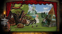
This video shows the games opening credits. The ground you walk on looks made out of cardboard and has tears, tape and worn areas that look really rough. Elements that come down from the top are actually suspended on string/rope so it has a real prop feel to it.
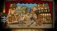
This video shows a boss character and it is clearly handmade with different elements stuck together and joined with rope and poles. The animation on it is very crude which works with the handmade design.
The character you play as is called a Sackboy which is like a sewn together doll so already there is a handmade theme in it's design. The levels are constructed by elements that look like magazine cutouts or stuck to card and them held together by string. It is a very pleasing and refreshing look for a videogame. Some of the animation is crude and the background elements look painted on which adds to the charm.
Here are some videos displaying the visual style:
This video shows the games opening credits. The ground you walk on looks made out of cardboard and has tears, tape and worn areas that look really rough. Elements that come down from the top are actually suspended on string/rope so it has a real prop feel to it.
This video shows a boss character and it is clearly handmade with different elements stuck together and joined with rope and poles. The animation on it is very crude which works with the handmade design.
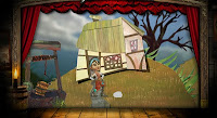
Second Idea Research: Fable 2
My second idea is to make the Magners brand look more modern, but I also want to use handmade elements that make it seem almost like an old stage show, contrasting old and new. I wont have any actors but I want the objects to look like and move like handmade props. I will have a look at some modern examples of this.
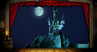
Fable 2: Theatre Show
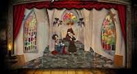
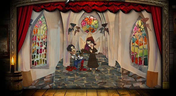
Along with the game Fable 2, the marketing campaign featured a flash based story that looked like a show in a theatre. It has interactive elements to make choices but the scenes are pre-rendered video. It is all framed by a stage with red curtains.
All of the elements look handmade with cut up pieces of paper. It looks very handmade and has a very charming natural feel to it. It looks very layered with pieces placed physically on top of each other. There is one part in particular where it has a tiled floor and stained glass windows, you can really see the individually cut out coloured pieces of paper scattered around. The overall aesthetic is very pleasing and I would like to capture part of that in my piece.
Here are some screenshots:

http://fable2.xbox.com/experience.aspx?lang=en-US
Fable 2: Theatre Show
Along with the game Fable 2, the marketing campaign featured a flash based story that looked like a show in a theatre. It has interactive elements to make choices but the scenes are pre-rendered video. It is all framed by a stage with red curtains.
All of the elements look handmade with cut up pieces of paper. It looks very handmade and has a very charming natural feel to it. It looks very layered with pieces placed physically on top of each other. There is one part in particular where it has a tiled floor and stained glass windows, you can really see the individually cut out coloured pieces of paper scattered around. The overall aesthetic is very pleasing and I would like to capture part of that in my piece.
Here are some screenshots:


http://fable2.xbox.com/experience.aspx?lang=en-US
Second Idea Research: A Series of Unfortunate Events
The move 'A Series of Unfortunate Events' has an motion graphics credits sequence that I think is very impressive and has some elements that I would like to include in my work.
I particularly like the start of the sequence. The children are in a boat in the distance, and there are waves moving in the foreground that jump up. What I like about this is that the waves look like they are 2D layers moving in 3D, like a cut-out. The transitions between scenes is also very pleasing because it all flows very well.
I particularly like the start of the sequence. The children are in a boat in the distance, and there are waves moving in the foreground that jump up. What I like about this is that the waves look like they are 2D layers moving in 3D, like a cut-out. The transitions between scenes is also very pleasing because it all flows very well.
New Project Idea
Having developed and storyboarded one idea based on 1940s and 50s experimental films, I have decided to develop another idea and then choose between them. With my original idea I started with thinking about the animation and that was informed by my research. This time I have instead focused on the rebranding aspect and the look of the project rather than the animation which is a good amount of contrast between the 2 ideas.
Thinking about the brand identity that surround Magners I found it was very based in tradition and an emphasis on age. Taking this I decided to see what it would be like to rebrand Magners and update the look of the marketing to be more modern. The project does state about creating logo files and this being a rebranding so this idea is more about that aspect. Other elements from previous branding such as emphasising that it's from Ireland and that it is still natural and somewhat traditional, I will be keeping and incorporating in to my designs.
I created a mock up of my magazine advertisement in photoshop using the idea that I have including a new concept for a logo. I have tried to base the look of logo on a sleeker typeface, and handmade elements as if they were roughly produced props for a puppet or stage show.

I created the logo using 2 of the main colours (besides black, white and yellow) in the current logo on the bottles. I used Arial Black, as it's similar to Helvetica, one of my favourite typefaces and is very popular for modern corporate work. I used the pen tool to trace one of the barrels in the existing logo and made it look different. I used textured layers to build up a dirty textured background which is meant to look the same colour as the drink.
I created the waves by drawing the outline with the pen tool then using images of acrylic paintings to make a really handmade, stage prop look for the waves. If I were going to hand make these for my final project I would paint some board myself then photograph it for use in Photoshop and After Effects.
I also created an image with other things I would like to use in my animation:

I have created an old fashioned ship out of cardboard textures to make it look handmade and the sails are made from cloth textures. I would like to animate the waves and the ship in After Effects like a stage/puppet show which has a handmade feel to the animation as well as the look.
Music
I have chosen some music that fits with the Irish themes but with a modern twist. The music of Flogging Molly fits this description, even though they are primarily an American band one of the members is Irish, their songs ave a lot of Irish themes and the genre they are classified as is Celtic punk. I have cut down 2 songs to 30 seconds to see which would work with my sequence.
(can't upload videos at the moment)
Seven Deadly Sins
My main concern with this song is that the lyrics say "seven drunken pirates, we're the seven deadly sins". I cannot edit the lyrics out and I feel that this would not get approved by the ASA, because it might seem to be glamorising excessive use of alcohol.
Drunken Lullabies
ASA Response
A couple of weeks ago I emailed the Advertising Standards Authority (ASA) to ask them if there were any additional requirements for information or logos in alcohol advertising. They just got back to me, and this is their response:
I followed their advice and checked out The Portman Group. They had a PDF of their guidelines as well as some 'Best Practice' guidelines that are not mandatory but promote a responsible view of alcohol. The PDF of their code is almost exactly the same as the CAP code, just slightly more brief. It is available here:
http://www.portmangroup.co.uk/assets/documents/4th%20Ed%20of%20Code.pdf
Something interesting I pulled from the Best Practice guidelines is the promotion of 'Drink Aware', which is a website that educates and promotes safety in the consumption of alcohol. Companies can (as an option) promote the drink aware website on their labels/marketing to show a responsible attitude to drinking. To show the logos and links in the marketing and on the labels it requires the company contain a free license to do so. As far as I am aware Magners does not have a license for drinkaware as it is not any of their labels or advertising but there is a link to it on their website, so I will not use this in my advertising but instead just use the self regulated 'Enjoy Magners Responsibly' message.
http://www.portmangroup.co.uk/?pid=28&level=3
Dear Alister,
Thank you for your e-mail to the Advertising Standards Authority (ASA). There are not any mandatory labels for alcohol advertisements, but I would recommend you contact The Portman Group for recommendations beyond what the Codes stipulate.
You can find out more about The Portman group here: www.portmangroup.co.uk
Kind regards, Olivia
I followed their advice and checked out The Portman Group. They had a PDF of their guidelines as well as some 'Best Practice' guidelines that are not mandatory but promote a responsible view of alcohol. The PDF of their code is almost exactly the same as the CAP code, just slightly more brief. It is available here:
http://www.portmangroup.co.uk/assets/documents/4th%20Ed%20of%20Code.pdf
Something interesting I pulled from the Best Practice guidelines is the promotion of 'Drink Aware', which is a website that educates and promotes safety in the consumption of alcohol. Companies can (as an option) promote the drink aware website on their labels/marketing to show a responsible attitude to drinking. To show the logos and links in the marketing and on the labels it requires the company contain a free license to do so. As far as I am aware Magners does not have a license for drinkaware as it is not any of their labels or advertising but there is a link to it on their website, so I will not use this in my advertising but instead just use the self regulated 'Enjoy Magners Responsibly' message.
http://www.portmangroup.co.uk/?pid=28&level=3
Subscribe to:
Posts (Atom)