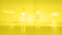
For Clip02 I was interested in the idea of using negative space to form the dancers in the animation instead of drawing shapes for them. Using photoshop I imported all the video to frames like before and I used the pen tool to isolate the dancers, then cut of them out of a fill layer. I then filled the gaps of the dancers on 3 different layers with different colours and space them out which is something I saw in my Persona 4 research. For it to work I needed to create a static background however, so I took a frame of the dancers and manipulated it with filters so that it was coloured to match the colour scheme and unrecognisable, then placed it at the bottom of the layer stack. This gave great contrast to the solid colour layers above it and contrast the movement by remaining static.
I then put the frames together in Adobe Premier as video and imported it in to After Effects to add some colour correction filters and overlays to make the contrast and colour pop a bit more.
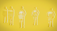
Here is a low quality preview:
Clip 25
For clip 25 I decided to go for a combination of ideas. I made the rotoscoping look a bit like water colours (but black instead of coloured) and then used some colour schemes and themes from my research in to Persona 4. Using photoshop I made the dancers have a pencil draw/painted look. Not quite perfect, broken and even lines make it look rougher and more hand drawn.
I then took this in to After Effects and edited several things to change the colour scheme, making it more like my persona 4 research. More interesting than white and red. I also animated some vertical lines of varying thickness across the screen across the sequence using solids and keyframes. I believe this adds an extra element of style to the scene as well as smoothing across the transition between camera angles.
Here is a low quality preview:
Clip 18
For Clip 18 I wanted to make something that was more than an outline but not so detailed that it was just the raw video. It is sort of a combination between my neon idea (the outline) and my chalk idea (the slight shading and trails). I imported the video in to Photoshop as layers, then exported the layers out as full quality jpgs. I then used Adobe Bridge to batch rename them to a sensible naming convention (frame followed by 2 digits).
I used combinations of filters and brushing to create a look that was partly looks drawn and partly like a neon sign (which extreme highlights). I recorded some actions to help speed up some of the more mechanical aspects of the editing and then went and edited individual frames. Unfortunately I had to desaturate the image because I was very unhappy with the mess of colours that came as a consequence of some of the effects. I intended to correct this in After Effects. I exported the layers again and imported them in to Adobe Premier as an image sequence, a 15fps video file. The processes I used were not ideal immediately, so I spent time cleaning up the images to be more focused on the dancers. Below is a screen grab of some of the extra detailed that existed before I removed it, and I believe it is better with just the dancers drawn.
I then imported the video in to After Effects and added additional effects. I used adjustment layers, solids and masks to make it more interesting than black and white. I chose orange and blue because they are contrasting colours and creates an interesting look. I then used some overlay effects to add more variation to the colours. Here is the result:
Here is a low quality preview:
Ideas: Research and Brainstorming
I have 3 clips to rotoscope and I have to use 3 different styles so the clips look different. They are at different parts of the video so they should not be designed to relate to each other or transition. I figured what most people will be doing is based on outlines, solid blocks of colour so I want to see if I can do something different in at least one of mine.
One idea I have is to make something that looks a bit like a chalk drawing. Not intricately shaded and coloured to look realistic but a simple style, a bit like a child but not looking bad on purpose. Just to capture the look of the material on black card. Here is an example from a stock photo to illustrate the look:
http://thumb10.shutterstock.com.edgesuite.net/display_pic_with_logo/449803/449803,1250580298,1/stock-photo-white-flower-on-a-blackboard-child-chalk-drawing-stylization-35446042.jpg
I experimented in Photoshop to get an idea of what I could do:
Another idea I have is to create a neon look. Much like neon signs that populate areas with a large night life scene (Las Vegas for example). I like the intense brightness and highlights contrasted against darkness. I don't think I want to recreate the mechanical look of neon signs, so I wouldn't make it look like it was coming from tubes or metal but the visual style I find interesting. Here is a visual example to illustrate what I mean:
http://www.myneonhaven.com/Neon-signs/uploaded_images/outdoor-neon-sign-775483.jpg
Another idea I have is based on a videogame called Persona 4 for the Playstation 2. The title screen uses 2 different styles that are like rotoscoping of the 3D models. The first features characters randomly scattered about the screen coloured in different shades of yellow against an image. The solid colours of the animated characters against the detailed background image creates a good contrast.
The second is a rotoscope of a character running in slow motion. This time everything around the character becomes a solid colour and you see the image behind it through where the character should be. This uses concepts of negative space to create the image of a person running.
I tested my idea:
These ideas are very appealing to me but heavily time consuming as the animation contains several layers which means drawing each frame several times. I will experiment with some ideas.
Importing Video to Photoshop
I intend to use Photoshop primarily to edit the frames, so knowing how to get the video in to photoshop is key. For this I used Adobe Photoshop CS3. From a combination of experimenting and lectures in class I have found an easy way to import video, change the framerate, export layers to files and then batch process them.
File > Import > Video Frames to Layers allows the video frames to be imported on to seperated layers.
Ticking the limit option allowed me to half the framerate, halving the amount of animation I would have to do to a more manageable level. From here I can export the frames as files so I can edit them individually.
Edited Video
Jack was kind enough to create a complete edited piece using the footage and as a class we agree to all use this version instead of deciding between our own edited versions. With the whole sequence together as a video we decided on how it would be divided. Although it would make sense to edit with the cuts in the film there aren't enough for each of us to do several. The video has been split up in to 3 sections for everyone of varying length:
01. Rhys
02. Ali
03. Dan
04. Toby
04b. Guy
05. Jack Wells
06. Matt
06b. Roarke
07. Steve
08. Guy
09. Jack Layfield
10. Kris
11. Roarke
12. Guy
13. Rhys
14. Steve
15. Jack Layfield
16. Roarke
17. Matt
18. Ali
19. Toby
20. Jack Wells
21. Kris
22. Dan
23. Toby
24. Matt
25. Ali
26. Rhys
27. Jack Wells
28. Dan
29. Jack Layfield
30. Kris
31. Steve
We also thought it might be a good idea to have a visual queue for which sections we were editing so Jack also made a video with our names overlaid on our sections.
http://vimeo.com/10349290
01. Rhys
02. Ali
03. Dan
04. Toby
04b. Guy
05. Jack Wells
06. Matt
06b. Roarke
07. Steve
08. Guy
09. Jack Layfield
10. Kris
11. Roarke
12. Guy
13. Rhys
14. Steve
15. Jack Layfield
16. Roarke
17. Matt
18. Ali
19. Toby
20. Jack Wells
21. Kris
22. Dan
23. Toby
24. Matt
25. Ali
26. Rhys
27. Jack Wells
28. Dan
29. Jack Layfield
30. Kris
31. Steve
We also thought it might be a good idea to have a visual queue for which sections we were editing so Jack also made a video with our names overlaid on our sections.
Named Dance video from jack wells blog on Vimeo.
http://vimeo.com/10349290
Research: Star Wars
In the Star Wars movies they use rotoscoping to create the effect of the lightsabers, as well as other effects but the most prevalent is the beam of the lightsaber. In this process the beam has been created an animated frame by frame to look like it is coming from the handle prop that the actors are holding.
This isn't especially relevant to my project but it is a good example of adding rotoscoped elements to live video.
http://www.youtube.com/watch?v=MFEjcvIRMDo
This isn't especially relevant to my project but it is a good example of adding rotoscoped elements to live video.
http://www.youtube.com/watch?v=MFEjcvIRMDo
Research: iPod
Apple's iPod ads are contemporary examples of rotoscoping of dancers. The first few sets of adverts featured realistic black figures dancing, as if they were a silhouette juxtaposed against a bright coloured background. The product is rotoscoped separately in white and stands out against the dancer. The contrast is very pleasing and even though it is a realistic look it has a good simplicity.
http://www.youtube.com/watch?v=NlHUz99l-eo
These adverts later developed, moving on from the black silhouettes and having coloured figures against differently coloured backgrounds. They art style is more abstract, with shapes and gradients in the background
http://www.youtube.com/watch#!v=PKxGfLo7Cqo
Footage Evaluation
Here is an evaluation of the clips we shot from the back of the room, in order to find the best parts.
Camera back 01
- Far left back dancer blocked.
- More blocking.
Camera Back 02
- More blocking
- Better than 01
- Some off frame
Camera Back 03
- Much less blocking
- Small stumble/stagger
- Cut off left edge
- Slightly off timing
- Best circle shot
- Bad jump
Camera Back 04
- More blocking
- In time movement
- Out of time movement
- Good jump
- Start not as good as 03
Camera Back 05
- More blocking
- Bad cutting off sides
- Hesitation
Camera Back 06
- Cutting off sides
- Better spacing
- Hesitation
- Out of time
- Ring cut off
Research: Strictly Come Dancing
To look at how dance sequences are edited on TV to see how I should edit mine.
The editing is quite slow compared to other TV shows, and cuts just before key moments in the dance.
New Project: Dance
For our new project we will be filming and then rotoscoping a modern dance sequence by dance students at the college to be projected on to a wall during the actual dance. Once the sequence has been filmed I will need to edit it together and then chop it up in to small chunks that everyone can edit before piecing them back together again.
Looking up contemporary and modern dance I get these definitions:
http://en.wikipedia.org/wiki/Contemporary_dance
http://en.wikipedia.org/wiki/Modern_dance
I will continue to read up on these so I have a better idea of what to expect in the project.
Looking up contemporary and modern dance I get these definitions:
Contemporary dance is a genre of concert dance that employs systems and methods found in modern dance and postmodern dance, as well as classical ballet. Contemporary dance draws on modern dance techniques as well as newer philosophies of movement that depart from classical dance techniques by altogether omitting structured form and movement.
http://en.wikipedia.org/wiki/Contemporary_dance
Modern dance is a dance form developed in the early 20th century. Although the term Modern dance has also been applied to a category of 20th Century ballroom dances, Modern dance as a term usually refers to 20th century concert dance.
http://en.wikipedia.org/wiki/Modern_dance
I will continue to read up on these so I have a better idea of what to expect in the project.
DVD Cover Design
I have created a design for my DVD cover based on the design of the animated menus. This provides me with an existing framework but also consistency between what's on the outside and what's on the inside.
I believe this be sufficient for submission but I am unsure as to certain aspects such as logos, so I have left them off.
Film List
I made a list of all the films and the categories they are contained in.
General Message:
1. Small Things by Guy
2. If by Roarke
3. CO2 Addict by Alister
4. CO2 Timeline by Matt
5. Your Country Needs You by Toby
6. The Attack of Carbonzilla by Christian
Food:
1. Bin Liners by Alister
2. Shop Local by Jack Layfield
3. Dig for Victory by Toby
4. Waste Not Want Not by Jack Wells
Transport:
1.Car Crash Bang Wallop by Matt
2.The Return of Carbonzilla by Christian
Lifestyle:
1. Recycle by Guy
2. New Outfit? by Jack Wells
3. Not a Superhero by Steven
DVD Design Ideas
In preparation for the DVD design pitch I have come up with some ideas for possible designs. The first idea I came up with was very simple, but I have rejected this pretty early on because I recognise my idea from somewhere else and I don't intend to press forward with a design that is already out there.
My second idea is to use textures and slightly abstract imagery. An image of a planet sitting at the top of the screen, paint then sprays out the sides and drips down the paper background. The camera then turns sideways and the paint stops, then the menu items appear.
I am not sure about the relevance of my menus, but I also don't know how relevant they have to be. Here is a video preview:
Submission for Client Approval - Monday 22nd February
Today, Monday 22nd February, I submitted my completed videos to the client Nick Adlam by presenting them on the projector in class. He seemed pleased overall. While his general lack of feedback on the videos left me feeling like he wasn't that interested he accepted them both and seemed happy with the overall message and the presentation.
For my Food base idea Nick, along with Andrew, had no requests or ideas for improvements and that video was accepted as it was which left me surprised but pleased. The CO2 addict video was probbably different from what he was expecting and he was more vocal about this one. Nick and Andrew both provided some suggestions. The only real problem Nick had with it was that he said that he felt the ending just cuts off like we are missing something, and I would agree. I couldn't quite work out how to end it correctly. The 2 suggestions I was givn for how to end it was a comical sign off, showing how he's changed or a small fade/cut with some appropriate text. To make room for this I was advised to cut down one of the sequences earlier in the video to 2 shots instead of 4.
I will need to make these improvements by Thursday 25th February to submit to the server.
Post Production Effects
The look of the raw video is not very good. It has very little contrast, harsh saturation and looks quite grainy. To make my footage look better I have used After Effects to apply several filters/effects to achieve something that looks better. The top is the raw image and the bottom is the edited version.
I have used colour correction, adjusted the levels to give it more contrast, lowered the saturation to create a bleached effect and created a simple 2D depth of field effect using a gradient ramp.
In Production: Bin Liners
Here is some image preview on me putting together some of my props. I had over estimated how much I could fit in to the pan, so I had to do a lot of trimming to find something that would fit and hold together without gluing or sticking it inside.
I wil require much more black bag to coat the inside of the oven.
CO2 Shoot Roundup
Having finally shot my CO2 video I can begin editing. There were many problems shooting this. I had to change some things on the fly, I had to change my ideas for camera positioning and angles. The actor I used did some variations on the lines I wrote which added something to them. I had the idea of recording a short and a characterised version of each line, but unfortunately some of the takes were ruined by an external noise or mistake that I didn't notice at the time.
Overall I learnt a lot about directing an actor and compromises I might have to make while filming if I make mistakes in my planning.
CO2 Addict Script
Here is a basic draft of the script for my CO2 addict film:
Tom: “Hi... my name’s Tom... and I’m a CO2 addict.”
*cutaway* Turning light switch on and off
Tom: “I’ve been addicted for 6 years now... and I’ve done stupid things to feed my addiction.”
*cutaway* Going to suck on car exhaust
Tom: “It’s easy to just keep using more and more and not seeing the effect it has.”
*cutaway* Sitting in living room surrounded by electronics
Tom: “But... yah know, my family have been very supportive and I’ve been clean for 6 months...
I don’t need it any more.
*cutaway* Turning off switches
Tom: “I can walk to town. I don’t have to take the car... right?”
*cutaway* Holding car keys, shaking
CO2 Addict
Due to the challenges presented by filming this idea I have had to adapt it to my skill and what resources I have available. I severely underestimated the planning, and with delays from the people I was counting on to 'act' for me I have had to postpone filming for much longer than I had intended and therefore had to scale back slightly and rethink my ideas based on some of my additional research.
I have changed my idea from a help/support group to an addict interview, as I saw in my social media addicts research proving it to be an acceptable format for my original concept. I will shoot the interview portion in a room, perhaps an office setting with neutral walls and objects. I will have some cutaways as originally planned, but might change and develop them to be more interesting.
Logistics and Planning
Now that I have 3 ideas that the client would like to see produced, I must work out exactly what I need to produce them, and the feasibility of my ideas.
1. General: Addicted to CO2
Setting:
Neutral, bland room. Clean, mostly empty. Small - medium square room.
Location:
Community centre room, or one of the smaller teaching rooms.
Characters:
One adult male, 18 - 30 as the main character. Other people in the room any gender or race, between 18 - 80. A variety would be good.
Props:
Chairs (to sit in).
Plastic/Ceramic Cups (to make it look like they have refreshments)
Car
Equipment:
Camera
Tripod
External Mic (Boom)
2. Food: Bin Bags
Setting:
Kitchen. Medium size. Clean, light. Standard layout, well furnished.
Location:
Flat or house kitchen.
Characters:
One adult, 18 - 30 as the main character.
Props:
Pots
Pans
Hob
Microwave
Bin Liners
Wooden Spoon
Carrot
Potato
Chicken
Equipment:
Camera
Tripod
External Mic (Boom)
3. Consumption: Child in a Box
Setting:
Several locations, inside and outdoors.
Location:
Shop
House
Bedroom
Kitchen
Lounge
Street
Characters:
One male (adult, young adult or teenager).
One child.
Props:
Bin
Equipment:
Camera
Tripod
External Mic (Boom)
Thumbnail Storyboards
I prepared some thumbnail storyboards for the presentation. I had so many ideas that I didn't draw them up in to full, big storyboards because I wasn't sure which ideas the client would like to use, although it still would have been good to have as much detail as possible. They show my 5 ideas as well as commentary on what will be going on and timings.
I will draw up some of these in to full storyboards.
Pitch Feedback
I gained a lot of useful feedback from the pitch, from the client as well as the lecturers and classmates. First of all, of the 5 ideas I pitched the 3 favourites were:
The motion graphics facts one was considered overdone and I was told not to make this one, much to my disappointment. I wanted to do a motion graphics video, but I know I should do what is best for the brief. Also, my 'Evolution of Walking' video was not very well received. I am not sure if it was considered 'bad' or just not as good as the 3 other ideas that were picked out. Ironically these ideas are the 2 that I developed the most and are my favourites but
Of all of them the Child in a box idea seemed the most popular, and most of the feedback was focused on that.
Another important issue raised is that I need to get written clearances from my 'actors' including the children (parents) otherwise the council can't use them. I will do some research in to the clearances and make it as professional as possible so when I hand them to the client it will be clear what they are.
The following lesson Andrew provided some additional feedback through the notes he wrote down during the pitch, which he has now distributed to us. Here are the notes:
It seems like I have a lot of work to do. Idea development, design decisions based on the feedback, serious planning and of course production and post production.
- General: Addicted to CO2
- Food: Bin Liners
- Consumption/Lifestyle: Child in a Box.
The motion graphics facts one was considered overdone and I was told not to make this one, much to my disappointment. I wanted to do a motion graphics video, but I know I should do what is best for the brief. Also, my 'Evolution of Walking' video was not very well received. I am not sure if it was considered 'bad' or just not as good as the 3 other ideas that were picked out. Ironically these ideas are the 2 that I developed the most and are my favourites but
Of all of them the Child in a box idea seemed the most popular, and most of the feedback was focused on that.
- The child should remind people of that unpleasantness of children/being a child
- Could be an older person pretending to be a child
- Could be a woman with a child (but might mistake it for a mother relationship)
- Walk past a shop window with better, smarter, cleaner children
- Could be an adult man who buys it
- Make the child a purchase rather than a gift
- Could be a brother and sister looking relationship, so someone else young
Another important issue raised is that I need to get written clearances from my 'actors' including the children (parents) otherwise the council can't use them. I will do some research in to the clearances and make it as professional as possible so when I hand them to the client it will be clear what they are.
The following lesson Andrew provided some additional feedback through the notes he wrote down during the pitch, which he has now distributed to us. Here are the notes:
Ali
PowerPoint - [presentation]
- good graphics
- Reading and a lot of text.
Adicted to CO2
- humourous
- video examples
Information overload
- Dynamic text
- Simple visual style
- Text moving with right angles.
Video 2: Food
- The wasting of food
Video 3 Transport
- using fun with walking styles
- Funny walks with captions
Video 4 Consumption and lifestyle
- child representing a piece of technology
- The boy is the phone and is put in the rubbish.
- do two or three inc the phone one and the addicted
- Amusing and quirky voices
- what about the boy being an adult that is green screened overlaid etc via After Effects.
- Different characters can relate to different technological devices and one can feel envious of another or overtaken by another but they both share the same fate and are both discarded.
- Can have other discarded children/ characters to create metonym of a world full of thoughtless throw away actions.
- Changing emotions of the phone/boy/ character, smug, working, concerned by rival, forlorn and rejected
It seems like I have a lot of work to do. Idea development, design decisions based on the feedback, serious planning and of course production and post production.
Client Pitch Part 1
I prepared a slideshow presentation for my pitch to the client. Here are the slides from that presentation. I used some artwork I made at the start of the project to make the title screen more interesting.
This is the first half of the presentation.
Climate Change: Food
Here is some research on the food topic in this project.
Here is a good video of a Peter Griffith, an agriculturalist from Shropshire talking about the carbon footprint on food production. Carbon footprint in food production is about "taking more than you need". Food is 13-14% of the average UK residents carbon footprint including production, processing, distribution, packaging and the fuel it takes you to get to the shop to buy it.
Agriculture is 44% of food production emissions. The reason for this is a lot of methane and nitros oxide is released, 21x and 10x more potent respectively. It's a system which produces these which add to the carbon footprint by releasing even worse greenhouse gases than CO2.
Transport of food is about 16%, half of which is heavy goods vehicles. The food miles aren't much of a big issue, since the agricultural side is so much worse. Reducing food miles will have an impact but not as much as changing your diet. By being vegetarian you eliminate the methane and CO2 generated by cows and turning them in to beef.
Research: Social Media Addict
The videos are a series of virals for a Sony laptop.
The video series are mock interviews and some of them are mock meetings for people addicted to social media. Some are very brief, but some are several minutes long. They feature very little other than a person looking towards the camera explaining their addiction. The age ranges of the people are varied, it doesn't seem important who is speaking so long as they look like the average person or someone relate-able. The dialogue is very upbeat and cheeky.
One of the interesting things about the pacing is that the short videos don't give time for introductions, it just dives straight in there. This time constraint creates a mystery to the piece because at first you aren't sure what the relevance is if you know the topic, or if you don't know then you aren't sure what the topic is. As in this example, where he is talking about World of Warcraft but you aren't sure why:
This next one is more direct, whereas the others were comedic. It's an actor claiming to be the organizer explaining the issue.
Research: Body Shaped Insulation
This animated short is a comical stab at our society with a green message. It shows an alien/monster suggesting a great idea to cut down on our heating - body shaped insulation. It soon becomes apparent that this idea is just clothes, different clothes that people can wear to cover themselves and use the heat stored in their body rather than turning some on.
I could use this idea of mocking a solution to climate change by introducing a very familiar concept, and this might open people's eyes to what they can do. Simple, but effective.
Research: Gusty and Ford
This is a very interesting and funny video. It uses a narrator to tell a grand tale, except all he is describing are road signals and signs and interpreting them in to a novel style story. It's genius lies in the interpretation of every day signs, that we don't see anything in but through this persons mind they represent something much more elaborate. The advert is to encourage people to walk instead of drive with the angle that walking can be more interesting.
Research: The Fun Theory
As a piece of viral marketing by Volkswagen is part of a project called 'The Fun Theory', asking can we get more people to take the stairs (instead of an escalator) by making it fun to do. This is an interesting theory, and the overall question is whether you can change behaviour by making an activity fun. In the piano video there are obviously health benefits from taking the stairs because you are using more muscles than simply standing and being lifted and moved across. The idea of making it fun makes it easier for people to choose between something that is beneficial for them over convenience, something that could ring true for my global warming message.
Using the idea of making beneficial things fun is a good one, but I wonder if they 'own' this idea, so anything I do in the same vein would be a complete rip off. If I even mention the idea of fun literally or through the video it will be in the shadow of this. Still, putting the 'good' thing in light of a positive thing like fun, it can enhance your message.
Here is another video in the series, they attempted to make putting rubbish in the bin more fun ad they found that more people would put rubbish in the bin than in a regular bin. This kind of idea is more workable. I could make an aspect of action against climate change, or recyling, seem fun or enjoyable.
This video is even more related to what I am doing. They applied their theory to a bottle bank, making recycling fun. They made a game out of it, in the style of a traditional arcade game with points. People putting their bottles in according to the lights and trying to get a high score. The bottle bank was used by over 100 people, and a nearby regular bottle bank was used by just 2 in the day. I could portray the act of recycling in a fun way by making it in to a game, or making a game out of carbon dieting or energy saving.
Subscribe to:
Posts (Atom)